

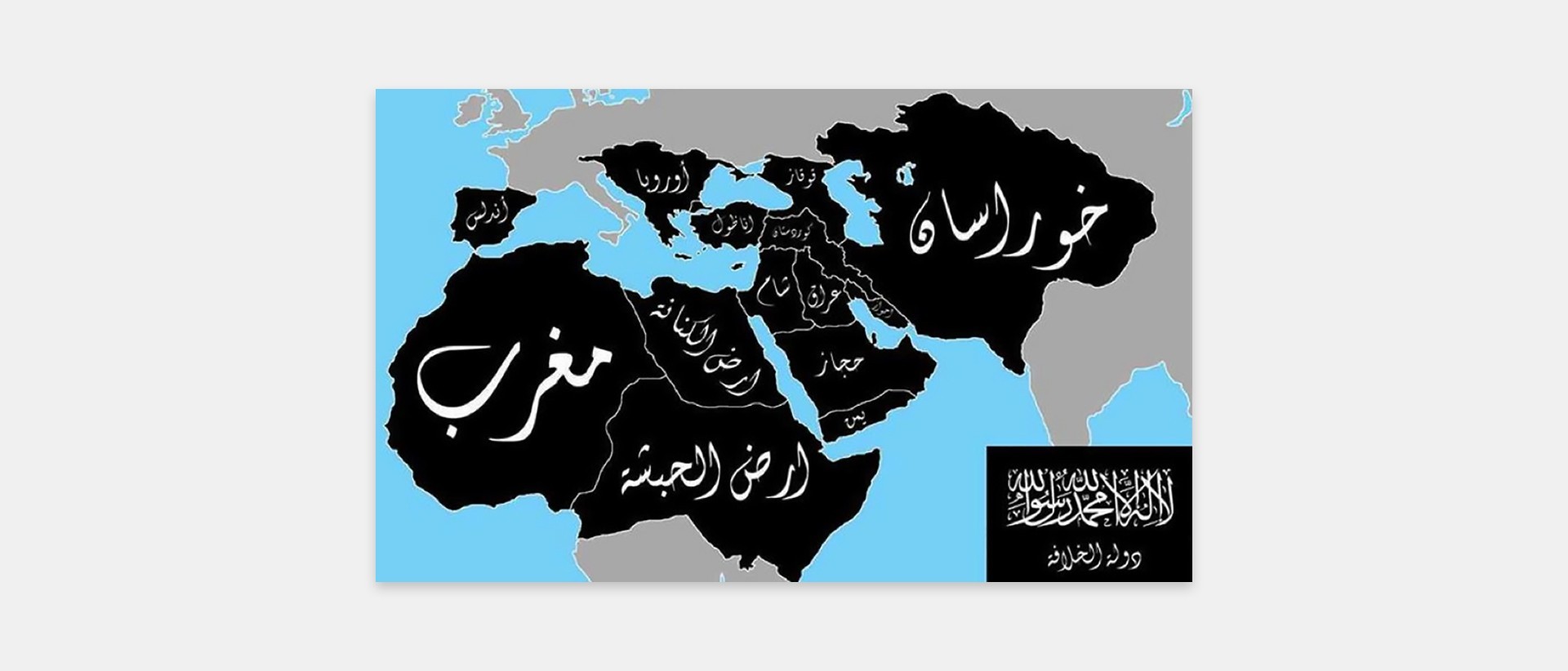

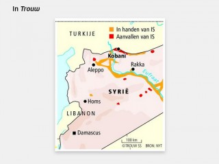
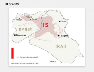
Astute followers of everything that has been written about IS may have noticed that the size of the IS-territory in Syria and Iraq differs from media-outlet to media-outlet. According to Dutch daily Trouw IS occupies just a few towns and stretches of land, whereas a map in another Dutch daily, nrc.next, shows an enormous territory ‘the size of Jordan’.
Why do various media-outlets publish widely diverging maps, sometimes in a timeframe of only 24 hours? And, more importantly, which map is correct?
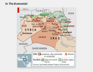
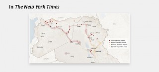
In August 2014, The Atlantic observed that maps can differ considerably. Having compared maps from The Economist and The New York Times (NYT) the journal concluded that there are many ways to visualize the Islamic State on a map. The size of the territory which was shown by The New York Times is no way near the size of the area designated by The Economist as IS-territory.
Which sources have been used for the maps?
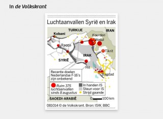
How are differences of this magnitude even possible? The most likely reason is that they are based on different sources. This is definitely the case with the maps in the Dutch newspapers. Trouw takes its maps from The New York Times, de Volkskrant from the BBC and The Institute for the Study of War (ISW) and nrc.next from The Economist, The New York Times and NRC Handelsblad.
A short survey to locate the original source has lead us to two institutions which produce the ‘basemaps’: the American Institute for the Study of War (ISW) and the Syria Needs Analysis Project (SNAP). There are also various journalists who publish maps based on their own research online, such as PolGeoNow and Careus Associates.
Maps are never neutral. In order to produce a map, a designer decides which information to indclude, based on his own criteria. Inevitably, part of all the available information will be lost. Which the selection criteria are used depends upon the intentions and motivations of the producer; he designs the image that best conveys his message.
The map as propaganda
The best example of how maps can be used to communicate a certain message are the maps that Germany produced in the 1930s These maps, which at the time were denounced by the US and Great Britain as propaganda tools, exemplify the power of a map in a geopolitical conflict.
The German maps showed the threat (imaginary or not) represented by the armed forces of the surrounding countries as compared to the very limited armed forces of Germany. German territory that could easily be occupied by Polish or French armies was already coloured.
These maps caused great concern among the Germans. They generated an urgent feeling of threat and justified a sizeable expansion of the German army.
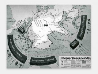
Source: Propaganda Maps: the Big Lie and the Surrounding Threat to Germany, JF Ptak Science Books (1927)
Interpretations of interpretations
Back to the maps in the Dutch newspapers. The question is to what extent the picture editors of these papers are aware of the potential impact of the maps they print. Apart from their choice of colour (Gray or red? Red = Danger!) it seems as if they have simply adopted the maps of other media, like The Economist and The New York Times.
Those media outlets produce maps based upon the original sources (ISW, SNAP) and add relevant information from other sources, including the department of Defense and their own reporters, according to their own insight. The maps that appear in Dutch media must therefore be regarded as interpretations of interpretations.
And: does IS occupy an area ‘the size of Jordan’?
As can be seen in the legend, The Economist highlights the areas where IS ‘is present’, whereas The New York Times shows only the territories that are actually occupied by IS-forces.
The Economist takes a broad view of the size of the caliphate. Not all territories they have coloured are actually occupied by IS. These are the territories that IS aims to occupy, is contesting, or where it has control over infrastructure – usually desert areas which are nearly uninhabited. The effect on the perception of the territorial size of IS is nevertheless enormous.
The map from the Institute for the Study of War, on which the NYT map is based, is more detailed and more useful for the actual interpretation of the territory of the Islamic State. It distinguishes between territories where IS is an actual occupying force and territories in which it enjoys support or could probably exercise power. These areas are marked by a ‘softer’ colour.
So which map is correct? The information that forms the basis of the different maps shapes the eventual visualisation: ISW collects information for research purposes, whereas SNAP collects information for the benefit of humanitarian support. In a few cases (The Economist, de Volkskrant) information is added from the Department of Defense. The different underlying objectives cause differences in the resulting maps.
The map that depicts ‘actual occupation’, produced by ISW, shows that IS is by no means a state with a coherent territory. The IS-territory is an area full of gaps and uncertainties. Coloured maps, like as the ones of nrc.next, include lots of areas that are not controled by IS. As yet there is no real Islamic State with the ‘size of Jordan’ and clearly delineated borders.
Remmelt de Weerd and Renée Zijlstra are part of factcheck-collective de Pinokkiofactor. Translated by Menno Grootveld.